
We’re Moving on UP
We’ve been laying the foundations for years – and now it’s time to build on it! We progressed from humble beginnings to an industry disruptor, and – although the old brand had served us well – it was time to take off the kid gloves and undergo a reimagination that reflected the calibre of our team and the work we were capable of.
![]()
We’ve constructed the new logomark on an isometric grid, giving the feel of an intriguing edifice. Working closely with hotels and the technology that forms the backbone of the digital hospitality industry, the new logomark brings structural connotations alongside the more technologically nostalgic sentiment that isometric design can conjur.
You could even say that the angle shows that we look at things from a different perspective…
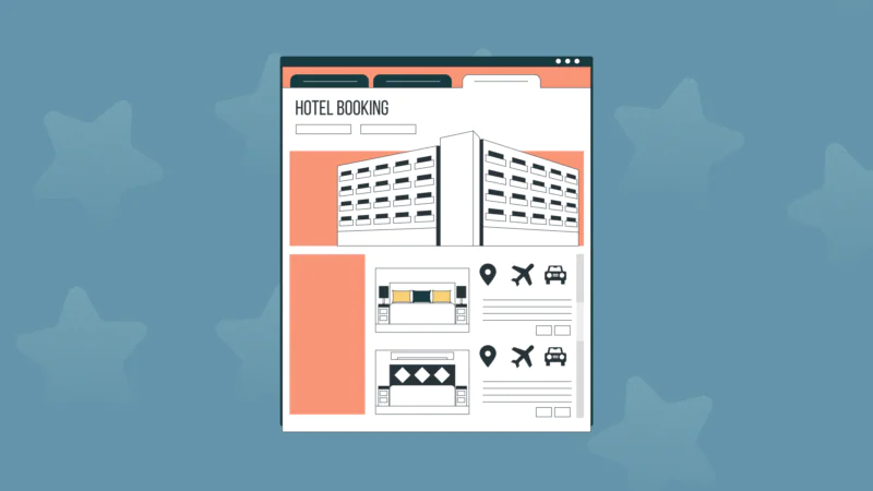
Let Your Work Shine Through
We’re rightly proud of the work we’ve achieved so far, and we wanted our new brand to work as a vessel to show it off! The logomark is cut out of its enclosing square to allow its background to shine through. We also created some upward-themed graphics to spice things up a little!
Of Type and Colour
Titilium and colourful low poly backgrounds were all the rage five years ago, but now we’re looking for something more timeless. We wanted a combination that better reflected our clients, our work, and our personality as a collective.

We opted for Tiempos Headline, in bold flavour, to take the mantle. Its confident, chiseled serifs are a strong suitor for our work with luxury properties; whereas its interesting counter spaces (the gaps in a, b, d, etc) and thick strokes are reminiscent of the more brave, ‘high kitsch’ identities our boutique partners have been undertaking in recent years.
This is paired with Graphik as a trusty, highly readable support. Its modern, more uniform appearance provides a suitable contrast against Tiempos without stealing the show.
Our previous brand palette had morphed into an amazing technicolour of combinations that would have made Joseph jealous – but lacked a lead part to carry the show. Our new accent teal provides a sophisticated backdrop for bright auxiliary colours to stand against, without giving into the temptation of becoming garish.
We still have plenty still in store, and an exciting future ahead – complete with a brand new website coming soon! We hope you’ll join us in our adventure in the coming months and beyond!
![Up Webaward 2025 Winners Cover [Blog Hero]](https://uphotel.agency/wp-content/uploads/2026/03/Up-Webaward-2025-Winners-Cover-Blog-Hero-800x450.webp)