Hotel Website Design: Designing for Mobile Devices
2011 is most definitely the year of the tablet. Following on the success of Apples’ iPad, most major tech manufactures are launching their own version of the increasing popular tablet-computing device. With the exponential popularity of these tablets adding to the array of mobile devices accessing the internet, it is not unreasonable to think that a person will completely their entire booking experience using a mobile device. The advanced capabilities of these new devices have made it possible to research and book your next holiday from your mobile phone. Your mobile hotel site design therefore needs to be compatible with mobile devices.
There are a few different approaches to take when developing for mobile devices.
Forced Redirect To Mobile Booking Engine
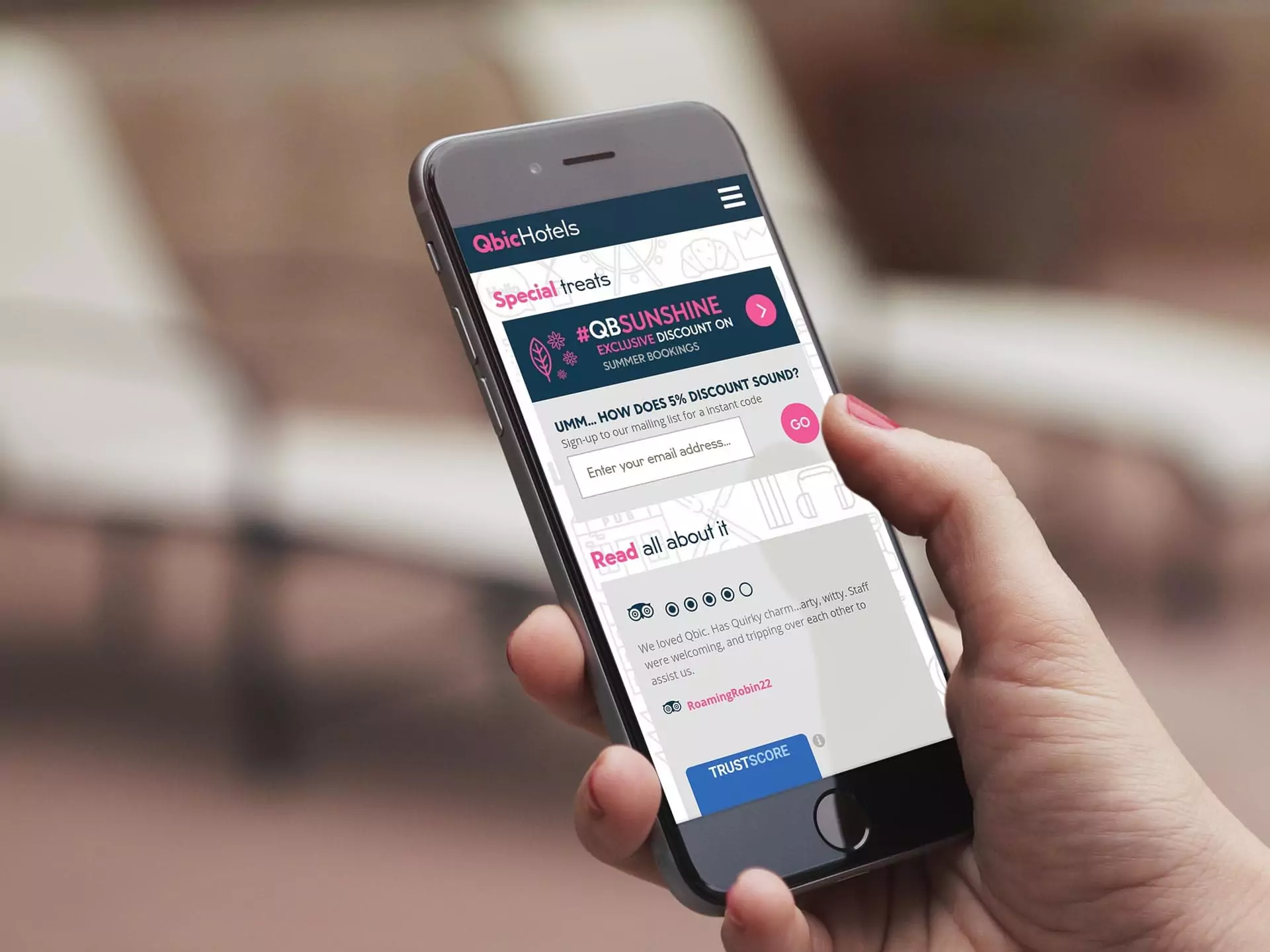
Some hotels have taken the route of automatically sensing if a user is using a mobile device and forwarding all these users direct to a mobile optimised booking engine. While this method does have certain cost benefits it does not make full use of the capabilities of many mobile devices. Apple mobile devices such as iPads and iPhones offer a full web experience with very much the same functionality as a desktop browser. While the basic functionality is present, the visual experience is severely crippled. As seen below the Ritz London forces even full web capable devices to the bare-bones mobile interface.

Mobile Specific CSS
A compromise is to develop mobile specific CSS. Without having to recreate and entire mobile version of your site, mobile CSS is used to arrange and style your existing web pages.
Full Mobile Version
The second most comprehensive but complicated approach is to recreate a complete mobile version of your existing website. For every page on your website a mobile version with mobile specific content design and graphic is developed.
A more simple option on the approach is identify a set limit of the most important pages of the existing website and only recreate these in a mobile specific version.
Full Mobile & Touch Version
The most comprehensive but complicated approach is to provide 3 version of the website pages:
- A version of traditional desktop browsers.
- A version specifically formatted and designed for non-touch mobile devices.
- A version specifically formatted and designed for touch devices. This would feature button and links are large enough to be selected by touch.
Differentiation between these options can be achieved by user agent detection. Depending on the device being used to access the page, the appropriate version will be returned.
A practical site structure or layout should be maintained. The mobile version could be hosted on a mobile subdomain or subdirectory. Likewise the Touch version will be hosted on a touch subdomain or subdirectory. For example:
Normal: www.boutiquehotel.com/
Mobile: m.botiquehotel.com/ or www.botiquehotel.com/m/
Touch: t.botiquehotel.com/ or www.botiquehotel.com/t/
Whichever option is chosen the following best practice design principles should be kept in mind:
- Don’t rely of Flash or JavaScript
- Try and reduce page sizes as much as possible
- Use bigger buttons and simplify navigation
- Limit scrolling to one direction
- Provide a go to the top link at th bottom of each page
- Provide an obvious link to the mobile version on the desktop pages
- Provide an obvious link to the desktop version on the mobile pages
- Submit a mobile sitemap to Google Webmasters Tools
- Try out your color scheme in bright sunlight to ensure it is still legible.
- Favor the use of html lists rather than tables
- Add alt text to all images
Contact us for a no-obligation mobile website for your hotel.