A frequently asked questions page – or FAQ for short – is an often under-appreciated tool in a hotel website’s arsenal. It’s one of the few places on a website where a user is obviously interested in what you have to offer – all they need is that small push to be convinced to book!
However, when it comes to content and layout, FAQ pages are all too often considered as an afterthought and seldom revisited during the course of a website’s lifespan. Improving your FAQ page is a unique opportunity to drive conversion and build a positive rapport with your guests.
Q. Why bother with FAQs?
A. For many sectors with a web presence, an FAQ section can be unnecessary as long as key information is present in relevant pages and sections.
For the hotel sector, the context is a little different. No matter how narrow your target audience, your guests will:
- come from different parts of the globe,
- with different economical and cultural backgrounds,
- and different interests,
- staying for different reasons,
- with different group sizes,
- arriving via different modes of transport
It’s difficult to satiate everyone’s stay criteria within the standard flow of your website’s content. An FAQ section can help as a fallback to reassure those whose questions may not have been covered. It can also help to keep guest sentiment positive and at ease, from pre-stay all the way through post-stay.

Q. What questions should go in there?
A. Put simply, the ones that get asked frequently! Think about what your hotel offers, and look inward – who comes into direct contact with your guests most?
Most of the time, this would be your reception staff; they often deal with guest enquiries either over the phone, by email, or even website live chat. One benefit to a well-populated FAQ section is that it filters out some of these basic enquiries, leaving more time for staff to address less common and more sensitive enquiries.
If your hotel incorporates a restaurant, liaise with your front of house. If you hold meetings and conferences, ask your event organisers. If you own a spa or gym, your front desk will prove invaluable.
Another avenue to explore are your review touchpoints, such as TripAdvisor, Google, Trustpilot, Revinate… the list goes on! Be on the lookout for recurring questions that appear on these platforms, as the users asking them are representative of your target audience.
That’s not to say every FAQ section is completely different to one another – being a hotel, there are a few basic questions users might expect to see:
- What are your check-in / check-out times?
- Is late check-out available?
- Can I bring pets?
- Is there a hairdryer?
- Is luggage storage available?
- What time is breakfast?
A carefully-considered list of questions will put you in good stead, and your guests (and staff!) will benefit greatly from it.

Q. How should questions be presented?
A. It’s key to consider that a user is likely to be feeling slightly frustrated by the time they get to the FAQ section – it means they haven’t yet found the answer they’re looking for, and this is one of the last lines of defence. You need to make it easy to read and easy to find the specific question; or else risk the user dropping out, in favour of an OTA or another hotel entirely.
How your questions are laid out depends mainly on how many questions you wish to populate the page with. If you have just a couple of questions, a simple heading / paragraph pairing for each question and answer will do.
If you find yourself with more than five questions, or the content is feeling quite long, you might like to set questions out with accordions. These are sections that begin by showing just the question, but can expand to reveal the answer content on a mouse click or tap. These make scanning for questions a much easier endeavour, and can feel a little less overwhelming on initial impression.
If your hotel has a restaurant, spa, meeting rooms – or any large non-standard offering for that matter – you may find that adding a category filter will help the user to find their question more quickly. If there are few questions, these could be separated by using the categories as headings. If you find each section has their own fair share of questions, you could hide and reveal categories by using category tabs.
You could even add a search input field for the user to more quickly find their answer. Here, it’s important that the user receives their results as quickly as possible without having to reload the page, or else the experience will feel frustrating and sluggish.
Finally, make sure you provide a point of contact or link through to your contact page in the event of the user not finding their answer. Without this, your user may feel they have no option but to leave the site. Usually, you would include a callout message either above or below your series of question blocks, but if you find yourself with a large number of questions you may wish to use both.

Q. How should questions be worded?
A. Your FAQ section acts on behalf of your customer-facing staff, so put yourself in their shoes. What language would they use? How would they impart information in a direct, understanding manner? Again, your users are likely to be a more negative headspace when they get to this page, so this isn’t the place for an inflammatory tone.
Word your questions in a general way to make it easy for users to search for them. That’s not to say they have to be devoid of character, but considering keywords a user would have in mind will make their experience much more swift and pleasant – especially if they’re using a search input field.

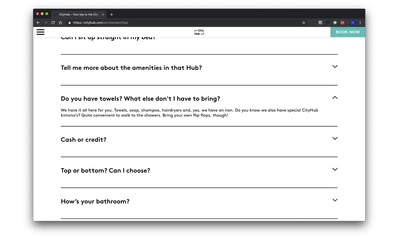
If your brand incorporates a unique tone of voice, an FAQ section can be a good opportunity to flex your creative muscles. Cityhub is a good example of communicating the questions in a conversational tone as a target guest, and riffing off that conversation in their answers. Although it makes some questions somewhat less direct, it also helps to soften the impact of some of the less desirable answers such as “Please note: we don’t take cash! No cash. (Did we mention: no cash?)”.

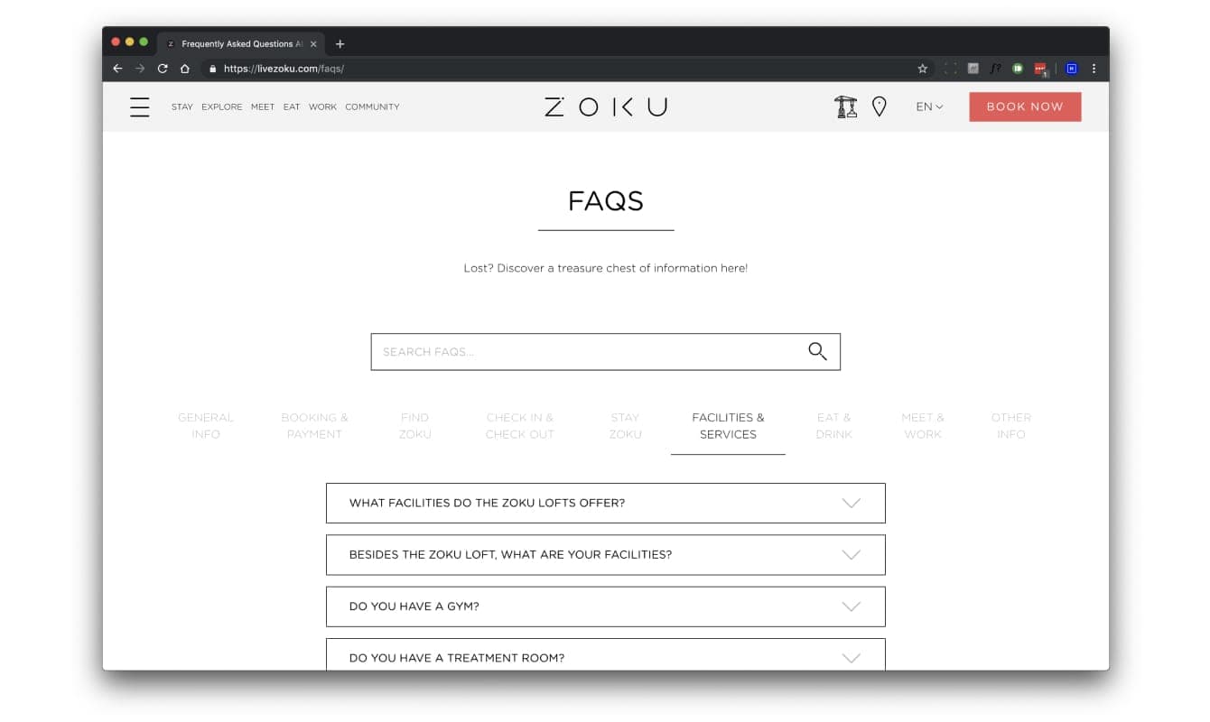
Zoku treats its FAQ section as a knowledge base, categorising its questions and including a helpful search function that updates whilst you type. Their page covers a myriad of questions of user might have through each stage of their stay: whilst perusing the site, whilst making a booking, during the pre-stay phase, during their stay, and also about their own expansion plans. They also take the opportunity to advertise some neat little features about their hotel that you might otherwise have missed during your journey through the site.

Q. Where should I link to FAQs?
A. First and foremost, if your website’s footer has the capability to contain links, it should go there. Much like a shipping policy or returns page on an ecommerce site, users would expect an FAQ section to appear at the bottom of every page.
The next places to consider are where your contact touchpoints are located. Think about where on your website users are most likely to pick up the phone or write an email, and whether a link to an FAQ would help to answer their possible enquiries at that point. Common areas could be at the bottom of a rooms page, a landing page specifically for business travel, or any other page that may be relevant to the questions in your FAQ page.
A lucrative place to include a call to action for your FAQ page is on your site’s contact page (or equivalent). If your page contains a contact form, just above or to this side of this is a prime location, as it encourages users to explore your FAQs before submitting an enquiry that has already been answered.
Q. What should I take away from this?
A. A good FAQ page is like a good safety harness: without it, your users risk dropping out! A strong FAQ page that tailors its content to its audience and makes it easier to find relevant answers builds reassurance and positive sentiment, and ultimately drives a pocket of conversion that would otherwise have slipped through your fingers.


![Up Webaward 2025 Winners Cover [Blog Hero]](https://uphotel.agency/wp-content/uploads/2026/03/Up-Webaward-2025-Winners-Cover-Blog-Hero-800x450.webp)